Didn't realize how badly I've been slacking on keeping content on here. Sorry about that..., been pretty busy at home & work lately & back in school as well, but I'll try to have fresh content more frequently.
Here are a couple of eye studies, a couple WIP character designs, and a poor attempt at a portrait. Pretty happy with most of it except the portrait. I'll give myself some slack as it's the first one I've tried in probably 10 years or more, but still, even my untrained eye can see it's waaaaaaay off from the reference pic. As a stand alone illustration though it's not that bad, almost looks more like a caricature than a portrait, which would be cool if I had been trying to draw a caricature lol. I'll include the ref pic so you can beat me up more easily. Please fire away with crits & comments, I need them!
Oh & here's a few more bits of classwork, some contour drawings & hatching:
Friday, February 15, 2008
Some Studies...


Tuesday, November 13, 2007
CD 18 update
Added frames to the walk & got the first frame inked. I'm starting to like this character too, now I need to think of a name & a story for her :)
I'll post more when I get to the transformation. No plans to use that for anything but I think it will be a great exercise for me. I have another exercise of sorts in the works, but I may hold off until I finish that & show it step by step, because so far I like how it's shaping up. In the meantime, let me know what you think of this character & the walk so far. Cheers  .
.
The media player here won't work for me, so here's a link to a SWF version that loops: Walk SWF
Wednesday, September 12, 2007
General Iron Nuts - And some TBS 4 talk
Well I finished this week's character design challenge & it's barely Wednesday! Usually I'm rushing to get these in at the last second, but this one was so much fun I couldn't take myself away from it.
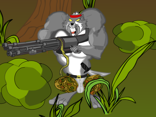
Here is the final image. I'm pretty damn happy with it. Couple things off as always, but again, I still feel I'm improving, & that's enough to keep me satisfied.
Name: General Iron Nuts
Age: Unknown
Weaknesses: None
Special Move: Iron Teabag of Death
I went nuts with some of the new features in TBS 4.0. Feathered edges in particular. I've gotta say I'm a huge fan! Something I discovered while playing with them was that you can go outside the set parameters of the # of steps and their width. TBS says the width can be between 5-100, and the # of steps can be 3-30. I actually can't say I tested all boundaries, but I know you can drop the width all the way down to 1. I got some really nice results with the settings on 1 width & 3 steps. It gave the drawing a lot of depth and also added a more painterly feel I think.
Here is an example using General Iron Nut's face. The first one is exactly as drawn, and the second is with feathered edges applied to thew whole thing, using the settings I mentioned above. I used that one for the final image.
I like both, but the feathered edges really add a lot to me. It's not a huge difference, but the subtle softening of the fur on his "cheeks" makes for a greater sense of depth, and it adds a little irregularity, which is also good. I've been trying to get away from putting hard black outlines around everything. It works sometimes, but more often than not I think it makes my work look flat & 2D. Not outlining everything in black was already helping, and I'm finding that using just the right settings with feathered edges can really add a lot to my drawings as well!
I plan on posting more soon about some the uses for new features in TBS. I have one in the works already that involves using feathered edges increasingly over time to aid in the effects of acceleration & speed. With a looping background it can be quite easy to make someone run/ride/drive from zero to light speed in no time!

Tuesday, September 11, 2007
Another Character Design Challenge
Well the Animation Forum picked up their character design challenges, and I'm in luck! I've been working on my anthro-critters lately, and wouldn' you know it, this weeks' challenge is "General Iron Nuts" a squirrel with the strength of a rhino, the speed of a cheetah & the full Rambo collection on DVD. This squirrel answers to no one.
I was pumped when I saw this challenge as it's going to be a great exercise for me. I think I'm getting some general ideas down when it comes to anthro-animals, thanks to the tutorials at drawfurry & some other tips, but as always I still have a lot to work on.
Here is a rough idea of what I'm going to submit for this challenge. It's nowhere near finished, but I still have a week to work on it. I think I like where it's going though,... I wouldn't mess with this squirrel.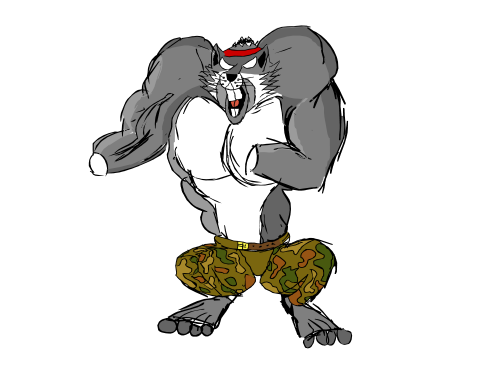
Sunday, July 22, 2007
A little character design
One of the forums I frequent runs a bunch of little challenges for their members to practice & learn from. They range from character design challenges (such as this one) that last about a week, to full blown animation contests that can last months. I've never really participated in any of these challenges, but I figure it's time I start. It's a good source of motivation & practice, so I will really try to get involved in more of them.
This particular challenge was a character design, here is what we were given: Name - Diamond Dan Jewels, Occupation - Jewel thief. Personality traits - intense hatred for mickey mouse. Looks - must wear sunglasses & carry a knife.
With that to go on, and having seen numerous other people's versions of this character, I decided to start off with a simple diamond shape. Then I made another one upside down, like a mirror image, and from those 2 diamonds (in green on first sketch) I made the head & face, which began looking a bit ape-ish, but I decided to roll with it. I got a couple good (I think) loose sketches of him in what I think is a pretty strong pose. It is for me anyway. I think I actually captured a "line of action" so that's a step in the right direction. I'm not thrilled with the colored version, but that wasn't the point of the challenge, & I painted it without too much thought or effort. Anyway, here they are, I will add a link to the thread with other challenge entries, but their site is down for an upgrade at the moment:
Diamond Dan Rough 1
Diamond Dan Rough 2
Diamond Dan Colored
Monday, April 9, 2007
Updates soon!
Just a quick note in case anyone is checking. I have completed my page of facial expressions for Larry, & will have it posted here by tomorrow afternoon at the latest. Along with that I should have a few storyboard sketches to post as well. Finally, if not tomorrow, hopefully on Wednesday I'll have a post comparing & contrasting hand-drawn, frame by frame animation with cut-out characters in Toon Boom Studio. Thats all for now, keep checking in.
Read more!Wednesday, April 4, 2007
Drawing, poses, and character design tips
I made some comments about character design in my last post, and I've been involved in several discussions lately involving the drawing process (yes it is a process), so I thought it would be useful to show how these are of the utmost importance to a quality toon. I will start with drawing. When I first got into cartooning & started drawing a lot, I was absolutely addicted to my eraser. I used it more than I used my pencil, but my drawing skill was not really improving. Maybe eventually I got close to what I wanted, but not usually, & even if I did, it was hard to ink the right lines on a new page because of so many rubbed out lines on the first draft. I was advised by some people to stop using the eraser and instead use different colored pencils to correct bad lines. This was some of the best advice I have ever received, because by leaving your bad lines where they are, you can draw a good one where they aren't. Whenever I erased anything, 90% of the time I drew another line right over the one I just erased, then erased it again!(rinse & repeat?) When I started sketching in color, it became much easier to alter my drawing without erasing, & you can see that in a couple sketches on my last post. The end result of this method is that in time you will end up being able to make more confident strokes with your pencil/pen, and you will be LESS prone to making the same mistakes, whereas when you erase all the time, you will be just as likely to re-draw the same bad lines.
Another thing I find to be an integral part of the drawing process is making revisions. I usually start out with a very loose & rough sketch that captures the general idea of what I want, i.e. body position, size etc. Then on a fresh sheet & using a light table, I go over all of the good lines from the first drawing & tighten up the bad ones (this can be done digitally in TBS using the light table feature). This usually leaves me with a decent drawing but probably not perfect. This is where I look for details that could/should be added. Mouth positions, facial expressions & hand gestures can all add tons of personality to your drawing if they are done properly. Doing them properly requires as much or more discipline as it does talent. That may sound strange at first, but the fact is that the world is full of extremely talented individuals that never had the perserverence or discipline to amount to anything. *steps off soap-box*
So, now we need to work on some of those expressions & poses. This part of the process takes alot of thought, and the more you put into it, the more you will get out. The best tip I can give is to follow in the footsteps of Preston Blair. He was one of the most talented cartoonists there was, and whether you know it or not, you all know much of his work from Disney & MGM. The following pics are pages from his books that illustrate alot of what I said about building a final drawing through a series of revisions & stages. I'm sure his drawings carry more weight than my words, but to futher illustrate the importance of doing all this, I will give myself a homework assignment & try to duplicate the page of facial expressions using my character Larry. It will be a challenge for me, but I will be better for having done it, and I strongly suggest you do it too.


Thursday, March 29, 2007
Introduction to "The Early Birds"
This post isn't meant to be a bible on what order to do things, because I am certainly no authority on the matter. In fact, maybe some people can clue me in on things I am doing wrong, because I'm sure I'm making plenty of rookie mistakes. Anyway, I have an idea for a series that I've just started working on, so I figure this is a perfect time to start sharing my workflow & such. This blog won't be 100% dedicated to this series, but since I'm starting the two at the same time, it will be a good opportunity to share my creative process as it unfolds. Hopefully some people will benefit from reading it along the way, and anyone with advice or tips for me is certainly welcome to share them.
Step one in the creative process is obviously generating an idea. I'm sure everyone's brain works a little differently, but I know that the majority of my ideas (or at least the good ones) seem to happen spontaneously, so based on that, I would advise anyone & everyone to always carry a pad of paper & a pen. When you have an idea, write it down, or you will be cursing yourself later. Now I had wanted to do something with a couple of fishing buddies for a while, but that was all I had, no artwork, no script, no setting, no character personalities in mind, just an idea for a buddy piece that revolved around fishing. So I just kept that much in the back of my mind until something else came to me.
So I'm working with an idea involving 2 buddies, & the obvious path is the standard odd couple spinoff, or a beavis & butthead/ Bill & Ted/ Wayne's world type thing, which is O.K. but played out. So then I thought of something more like a Tom & Jerry or Coyote & Roadrunner relationship, which again is all well & good, but been done a million times. Then I decided based on a quick sketch I had done that my fishing buddies would be birds... no reason other than I liked the sketch & it looked something like a bird crossed with Grover from sesame street.
Now I have two buddies that sort of fall into the "Tom" & "Coyote" role, but who is "Jerry" or "the Roadrunner?" Well, fishing buddies need bait, & birds eat worms, and there's no bait more timeless than the humble worm, so... I found my third character, & more importantly, my "Jerry." At this stage I have the general idea for the overal story, two protagonists, and now my antagonist. I also have a few initial sketches that I've done which you can see here: 


This is the character design phase, where I put some thought into who these characters are, how they move & what their personalities are, and of course try to bring all of this out in the drawings. The best example I have of this so far is this walk cycle of Larry. The first 7 frames I like, but I did a horrible job on the second half of the cycle, I was in a big rush to ink it, the pencil drawings actually look better. It is 13 frames on 2's, & as it stands right now I'm happy with the motion except for frames 8 & 9, I need to have his right leg look more like he is swinging it out to the side as it comes around. Anyway...
The main characters are Larry & Ron (I'm not married to the names but for now...) and of course the worm, I'm thinking he'll be called either "Cyn" or "anti" - more on why later. Anyway, Larry is a turkey vulture. He is a very laid-back, relaxed country boy, sort of awkward & goofy but still the man. He fishes because there is no better way to spend his time, plain & simple. Ron is more of the NRA type, donned in cammo gear, militant patriotic attitude etc, that fishes & hunts for sport. Now I have been using the names Larry & Ron because my first thought was to take a political angle with this toon, having Larry represent my liberal views while Ron represents my conservative ones. The worm is going to be loosely based on Antisthenes (student of Socrates & founder of the "Cynic" school of Philosophy) hence his name being either Cyn or Anti. He will be the one who points out the plethora of hippocritical behavior that he sees in both Larry and Ron. I also envision him with a big time Napoleon complex, he will have a tough-guy attitude & will always be ready to kick ass & take names, but alas, he is a worm.
I'm pretty comfortable with the characters right now, & think they have the potential to play off each other quite nicely if I can manage some decent scripts. At the moment I am still developing exactly what each character will look like from all angles, & figuring out how I want them to move. Aside from that I have been laying out some backgrounds & landscapes to try & establish the world they live in. Here are a couple super-rough sketches of Larry & Ron's bedrooms I have so far, they're totally out of proportion & perspective, but they capture the general idea I want.

Well, that post was longer than expected, but I've been writing it in pieces for a few days. I'll try to keep future posts shorter & more frequent, but I hope it was worth the read.... probably not.


